Log Comparison
Overlaying fuel data from multiple log files at a fixed load or RPM
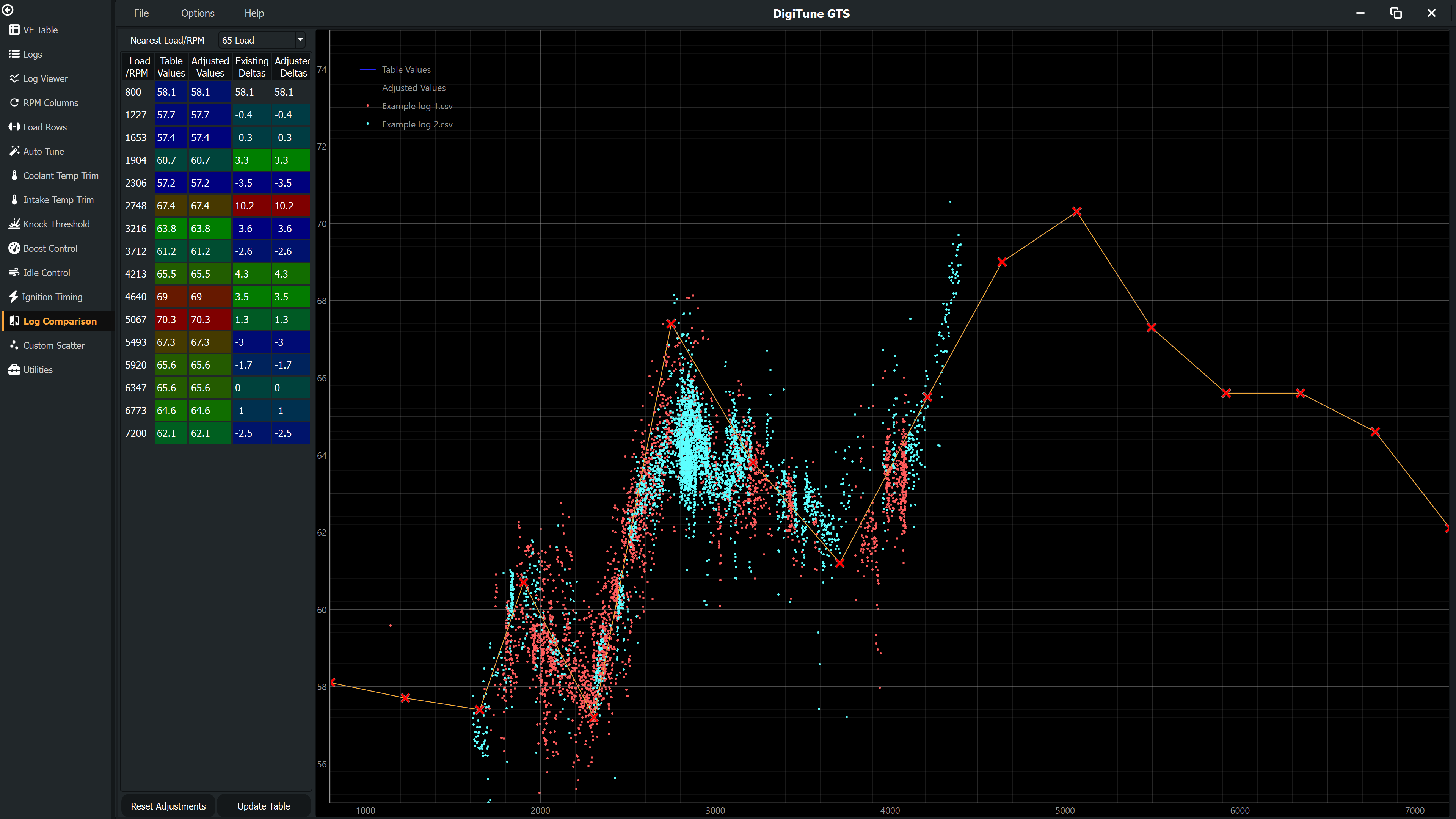
The Log Comparison page plots fuel data from each individual log file in a different colour on the same graph. This lets you check whether your tuning results are consistent across separate sessions and spot any logs that look like outliers.
How to use it
- Load two or more log files on the Logs page and ensure all are checked as included.
- Navigate to the Log Comparison page.
- Use the dropdown to select either a Load value (%) or an RPM value to slice by. The graph then shows data only from near that value, across all logs.
- Each log appears as a distinct colour in the legend. Consistent logs will have their scatter clusters overlapping; inconsistent logs will sit noticeably higher or lower.
What to look for
- All logs agree — Your calibration is consistent and the map is well-tuned at this operating point. The data from different sessions overlaps cleanly.
- One log is an outlier — That session may have had unusual conditions (different fuel, sensor issue, very different ambient temperature). Consider unchecking it on the Logs page to exclude it from tuning calculations.
- All logs are shifted in the same direction — The calibration needs correcting at this operating point. Go to the Fuel / VE Tuning pages to apply a correction.
- Scatter is wider in some logs — Those sessions had more transient driving or less steady-state data. This is normal; the quality colouring helps identify which points to trust.
Data quality filter
Only data points above the Log Comparison Min Data Quality threshold are shown (default 80). Points below this threshold are excluded so that noise from transient conditions does not obscure the comparison. You can adjust this threshold in Settings.